
Colour plays an important role in interior design and it can completely transform a room. By adding a lick of paint and a few well-chosen accessories you have changed the ambience, mood and tone of your room. It also has the power to give an illusion of space or make a room seem smaller, giving it a cosier feel.
That sounds easy right? But where do you start when it comes to colour design and moving away from the cream walls. What you would like to inject some colour into your room? But, how do you know your colour choices will look good together?
Well it’s time to pick up your pens and make some notes on the theory of colour. Yes, there is a theory and once you understand the basics, you can be more confident with putting it all together, stepping back and saying I designed that!
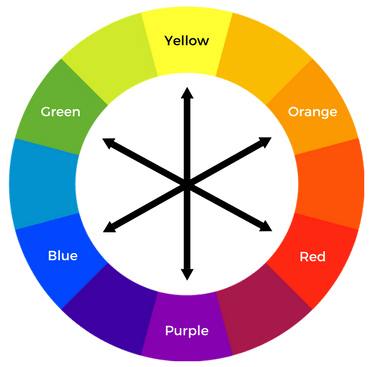
Let’s start with the basics – aka the colour wheel.
The colour wheel is a reliable source for anyone who works with colour, to know what works and what doesn’t. Those that are in the design industry have a knack of knowing what colours work well together. And the reason why, is because they have all learned the theory of colour. So, let’s go……
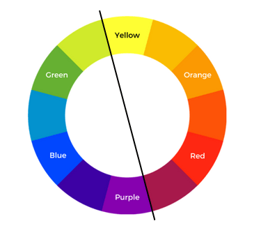
The classic colour wheel, as seen here is made up of 12 sections called hues (colours). This wheel can be divided in half with one side being the cool colours and the other being the warm. Reds, oranges and yellows are warm while greens, blues and purples are cool. You can literally strike a line through the middle of the circle to determine the cool and the warm.
Let’s delve a little deeper and into the three levels of colour in this wheel:
- Level 1, these are your primary colours which are Red, Blue and Yellow.
- Level 2, are your secondary colours which are Green Orange and Purple.
Level 3 are tertiary which are a mix of one primary with one secondary.
Mix a Yellow with Green and what do you get? Lime.
Mix Blue with Green and you get turquoise.

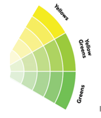
From these 3 levels we also have our tones, shades and tints which are created when adding colours not in the wheel.
Adding grey to a colour will change the Tone.
Adding black to a colour will change the Shade
Adding white to a colour will change the Tint.
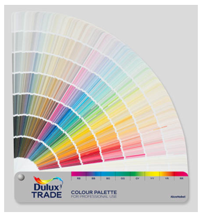
We have an abundance of colours to choose from especially in the world of interior design. Luckily our paint manufacturers have got all the tones, tints and shades sussed, which is why we have so many colours to choose from.
With the basics understood (hopefully), how can we now apply this theory to our homes?
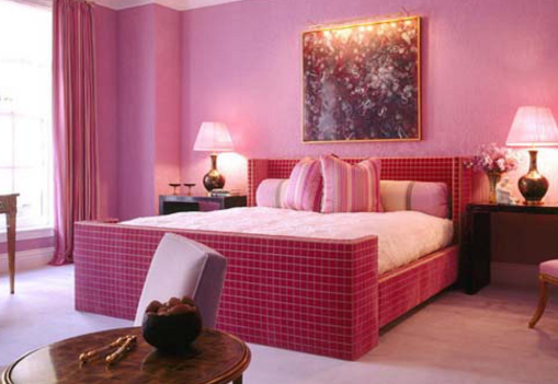
First up…Monochrome
You can be forgiven for thinking that a monochrome design is black and white, but it’s not, mono- chrome just means one-colour.
The good news is that these styles are the easiest to pull together. But the bad news is that using the warmer colours can look over the top by being too bright!
If you are designing a house to sell or rent out as an AirBnB, monochrome is a crowd pleaser for sure but if you are wanting to add style to you home and inject some personality then this can become boring. If you want to be brave with your monochromatic scheme add different tones and tints of the same colour. This will keep your design interesting and it makes the use of pattern in accessories extremely easy to incorporate. You just match them by colour.
Just take a look at a colour chart from any paint company to start to see how it works. To be truly monochromatic you wouldn’t mix other colours, but rules are there to be broken, so mixing neutral accessories in whites, greys, metals and woods can work well to break up the one colour scheme.
To be a little more adventurous look at using Harmonious colours
This is where you would select 2 or maybe 3 colours that sit next to each other on the colour wheel, so red with orange, yellow with green or green with blue. These are easy to work with, although can be somewhat overpowering in a small area if gong for the brights. However, using a lighter tone of the same colours can work equally well.
Or are you more of a complimentary person….
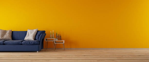
These colours are on the opposite side of the colour wheel to each other. As they say, opposites attract and the contrast of opposite colours make for a great colour combination. This is very much a mix of cool and warm shades together.
Go back to what nature intended, take for example a red hibiscus with its lush green leaves, a perfect match!
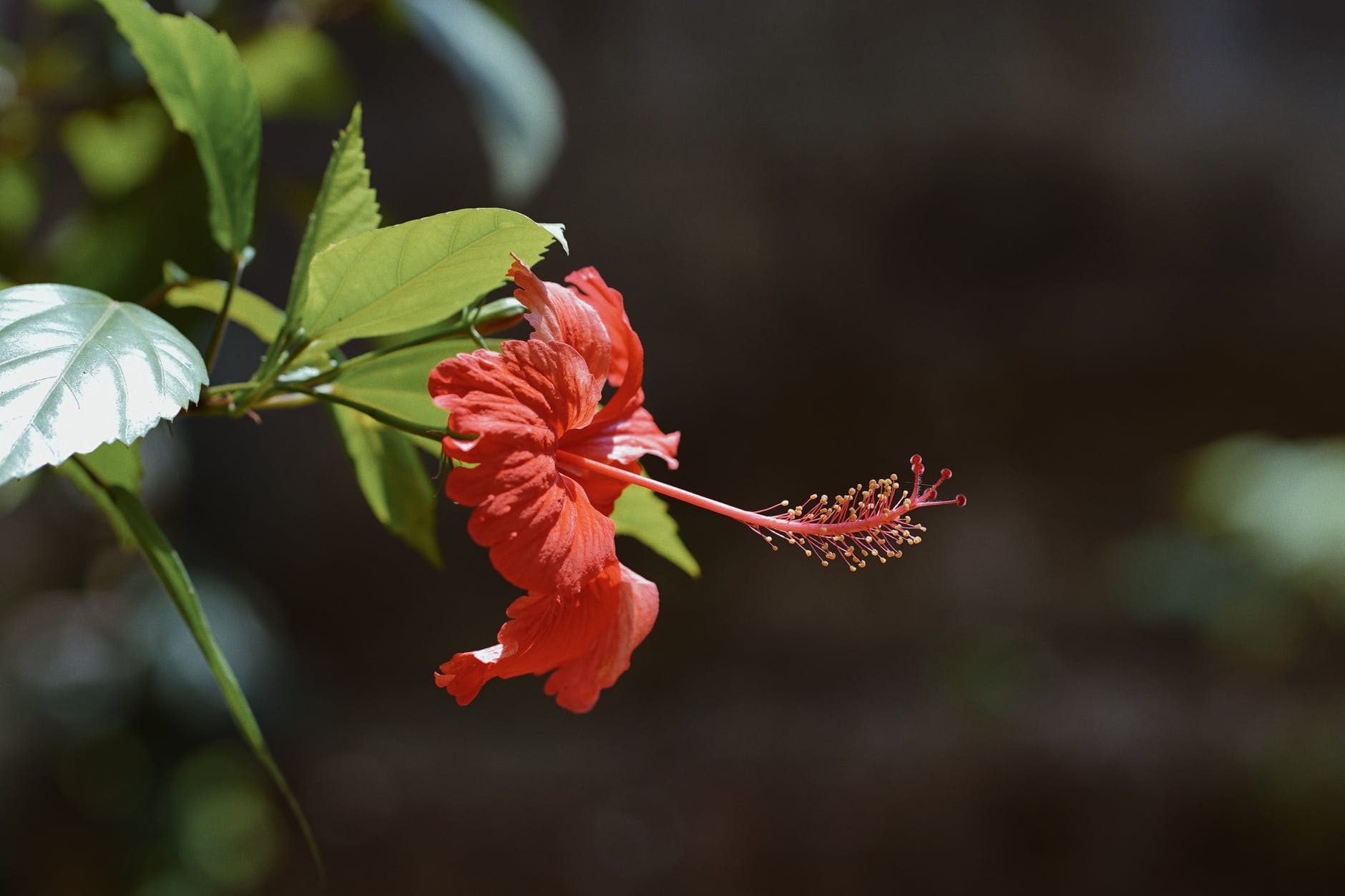
The important thing to know with the complimentary colours is that they create very dynamic and exciting colour schemes! You can have great fun with these especially when it comes to accessorising and bringing a real punch of colour to a cool backdrop.
Start to do some research online or purchase some home magazines and cut out images of the colour schemes you are most drawn to. This is most likely your comfort scheme. Go to your local hardware store and grab some colour swatches in your chosen colours. These aren’t just useful for your paint colours, I use them to colour match accessories too.
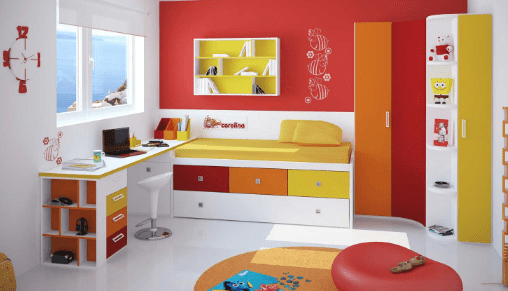
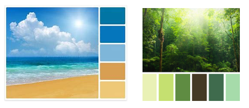
If your home is coastal, you may want to take inspiration from what you see from your window and match some of these colours, the same if you are inland and surrounded by trees and shrubs. Start to pick out the key colours of your scheme and then start to blend in tones, shades and tints of other colours. As here, we have different shades of greens and blues with a pop of colour that ties the scheme together.
The important thing is to enjoy putting your new scheme together, take your time, and be confident with your choice. At the end of the day, if you don’t like your chosen colour, just paint over it!
